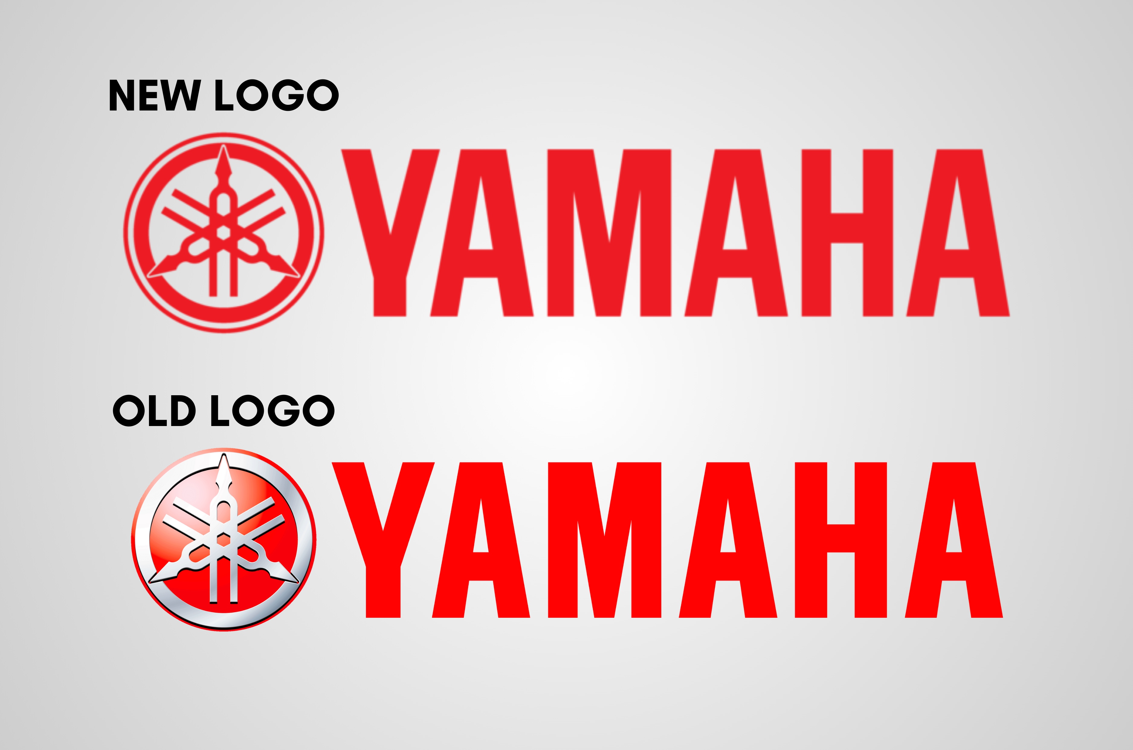
Yamaha Motor Co announced today that it will be changing the design of its corporate logo for the first time in 27 years this year, which also marks the 70th anniversary of Yamaha Motor’s founding in 1955.
- New logo now 2D and easier to use for digital applications
- Yamaha also created a special 70th anniversary logo
Yamaha new logo design details
The new corporate logo has been designed with digital applications in mind and uses a flat (2D) Tuning Fork Mark for greater conspicuity. Starting this month, the Japanese automaker will gradually begin transitioning over to the new design.
Yamaha Motor has also created a special logo to commemorate its 70th anniversary. Designed under the concept of ‘Everything Begins with a Challenge’, the logo was based on the racing number plates used in the company’s first motorcycle race shortly after it was founded. The 70th-anniversary logo will be used in various events, marketing tools, and corporate items throughout the year to publicise this milestone internally and externally.
Yamaha’s tuning fork mark
A tuning fork is a tool for tuning musical instruments. It was invented by a trumpet player named John Shore (1662-1751). The tuning fork is composed of a handle attached to the centre of a U-shaped steel rod. By striking the rod, sound is created, and the frequency of the resulting vibrations per second is used as a standard for tuning a musical instrument.

According to Yamaha, "The three tuning forks of the Yamaha logo represent the cooperative relationship that links the three pillars of our business -- technology, production, and sales. They also evoke the robust vitality that has forged our reputation for sound and music the world over, a territory signified by the enclosing circle. The mark also symbolises the three essential musical elements: melody, harmony, and rhythm."
Also see: Aprilia Tuono 457 India launch in February